
Angularでのグラフプロット
angularでグラフ作成を行うライブラリはngx-chartsが有名ですが、ngx-chartsを使った円グラフや棒グラフのプロット方法はqittaに解説記事があったのですが、株価チャートのような折れ線グラフのプロット方法については日本語の記事がざっと見た感じ当たらなかったので、保存用に書いておこうと思います。
【作業環境】
- Angular8.2.3
ngx-chartsのインストール
# モジュールをインストールする
$ npm install @swimlane/ngx-charts --save

# コンポーネントを追加する
$ ng generate component ngplot-sample
ngx-chartのバージョンとAngularのバージョンの対応はhttps://swimlane.gitbook.io/ngx-charts/changelog
を参照してください。最新版を古いバージョンのAngularで使おうとするとエラーが出ることがあります。
<app.module.ts>
import { BrowserModule } from "@angular/platform-browser";
import { NgModule } from "@angular/core";
~~~~
~~~~
import { NgplotSampleComponent } from "./ngplot-sample/ngplot-sample.component"; //これを追加
import { NgxChartsModule } from "@swimlane/ngx-charts"; //これを追加

@NgModule({
  declarations: [
    AppComponent,
    ~~~~
    ~~~~
    NgplotSampleComponent,//これを追加
  ],
  imports: [
    BrowserModule,
    AppRoutingModule,
    BrowserAnimationsModule,
    ~~~~
    ~~~~
    NgxChartsModule,//これを追加
  ],
  providers: [],
  bootstrap: [AppComponent],
})
export class AppModule {}
<app-routing.module.ts>
import { NgModule } from "@angular/core";
import { Routes, RouterModule } from "@angular/router";
~~~~
~~~~
import { NgplotSampleComponent } from "./ngplot-sample/ngplot-sample.component"; //これを追加!

const routes: Routes = [
  { path: "plot", component: NgplotSampleComponent }, // これを追加!
];

~~~~
~~~~
<ngplot-sample.component.ts>
import { Component, OnInit } from "@angular/core";
import { Injectable } from "@angular/core";
@Injectable({
providedIn: "root",
})
@Component({
selector: "app-ngplot-sample",
templateUrl: "./ngplot-sample.component.html",
styleUrls: ["./ngplot-sample.component.css"],
})
export class NgplotSampleComponent implements OnInit {
// グラフの表示サイズ
view: any[] = [700, 400];
//色設定
colorScheme = {
domain: ["#5AA454", "#A10A28", "#C7B42C", "#AAAAAA"],
};
//チャートに表示するデータ
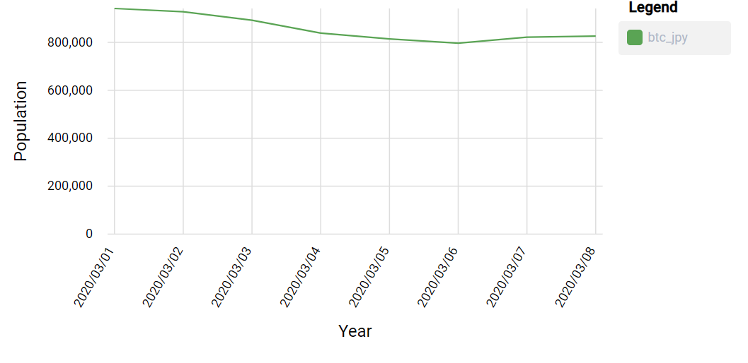
sampleData = [
{
name: "btc_jpy",
series: [
{ name: "2020/03/01", value: 941263 },
{ name: "2020/03/02", value: 927433 },
{ name: "2020/03/03", value: 891997 },
{ name: "2020/03/04", value: 838375 },
{ name: "2020/03/05", value: 814149 },
{ name: "2020/03/06", value: 796400 },
{ name: "2020/03/07", value: 821648 },
{ name: "2020/03/08", value: 825701 },
],
},
];
// チャートの設定
legend: boolean = true;
showLabels: boolean = true;
animations: boolean = true;
xAxis: boolean = true;
yAxis: boolean = true;
showYAxisLabel: boolean = true;
showXAxisLabel: boolean = true;
xAxisLabel: string = "Year";
yAxisLabel: string = "Population";
timeline: boolean = true;
constructor() {}
ngOnInit() {}
}
<ngplot-sample.component.html>
<ngx-charts-line-chart [view]="view" [scheme]="colorScheme" [legend]="legend" [showXAxisLabel]="showXAxisLabel" [showYAxisLabel]="showYAxisLabel" [xAxis]="xAxis" [yAxis]="yAxis" [xAxisLabel]="xAxisLabel" [yAxisLabel]="yAxisLabel"="timeline" [results]="sampleData" (select)="onSelect($event)" (activate)="onActivate($event)" (deactivate)="onDeactivate($event)"> </ngx-charts-line-chart>
[results]にプロットするデータを指定します。
http://localhost:4200/plotにアクセスすると以下のような画面が表示されます。
今回は固定の値を使いましたが、実際にはAPIを叩いてデータを取得して整形するといった処理が必要になってきます。

コメント