
今回はpython-pptxでPowerPointのスライドにエクセルの折れ線グラフや棒グラフを追加する方法について紹介したいと思います
基本的な使い方については下記参照
関連記事:【Python】python-pptxでパワポの資料作成を自動化する
前準備
まずはライブラリをインストールします
$ pip install python-pptx -q
python-pptxでパワポにエクセルのグラフを追加する
XL_CHART_TYPEは、グラフの見た目や表現に関連する設定です。例えば、グラフの種類を指定することで、縦軸や横軸に表示する情報や、グラフの色や形状などを変更することができます。
具体的には、以下のような種類があります。
– XL_CHART_TYPE.LINE:線グラフ
– XL_CHART_TYPE.BAR:棒グラフ
– XL_CHART_TYPE.PIE:円グラフ
– XL_CHART_TYPE.AREA:面グラフ
– XL_CHART_TYPE.SCATTER:散布図
– XL_CHART_TYPE.RADAR:レーダーチャート
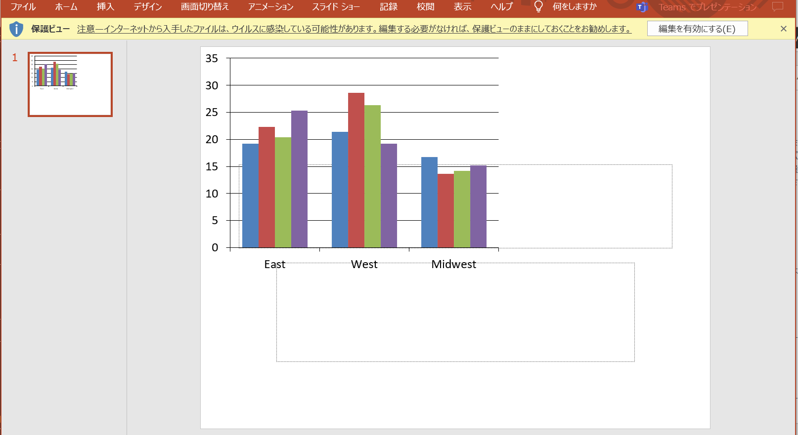
棒グラフ
from pptx import Presentation
from pptx.chart.data import ChartData
from pptx.enum.chart import XL_CHART_TYPE
from pptx.util import Inches,Cm

prs = Presentation()
layout = prs.slide_layouts[0]
slide = prs.slides.add_slide(layout)

# エクセルのグラフを読み込む
chart_data = ChartData()
chart_data.categories = ['East', 'West', 'Midwest']
chart_data.add_series('Q1 Sales', (19.2, 21.4, 16.7))
chart_data.add_series('Q2 Sales', (22.3, 28.6, 13.6))
chart_data.add_series('Q3 Sales', (20.4, 26.3, 14.2))
chart_data.add_series('Q4 Sales', (25.3, 19.2, 15.2))

# グラフをプレゼンテーションに追加
x, y, cx, cy = Inches(0), Inches(0), Inches(6), Inches(4.5)
chart = slide.shapes.add_chart(
   XL_CHART_TYPE.COLUMN_CLUSTERED, x, y, cx, cy, chart_data
).chart
# PowerPointファイルを保存
prs.save('sample_with_chart.pptx')
x, y, cx, cy = Inches(0), Inches(0), Inches(6), Inches(4.5) の部分でスライドのどこ(x,y)にどれくらいの大きさ(cx,cy)で図を挿入できるかが指定できます。
<実行結果>
折れ線グラフ
layout = prs.slide_layouts[0]
slide = prs.slides.add_slide(layout)
chart_data = ChartData()
chart_data.categories =['2019-01-01','2019-01-02','2019-01-03']
chart_data.add_series('price',('100','200', '300'))


x, y, cx, cy = Inches(2.5), Inches(2.5), Inches(6), Inches(4.5)
chart = prs.slides[1].shapes.add_chart(
    XL_CHART_TYPE.LINE, x, y, cx, cy, chart_data
).chart
chart.chart_style = 11
prs.save('sample_with_chart.pptx')
<実行結果>

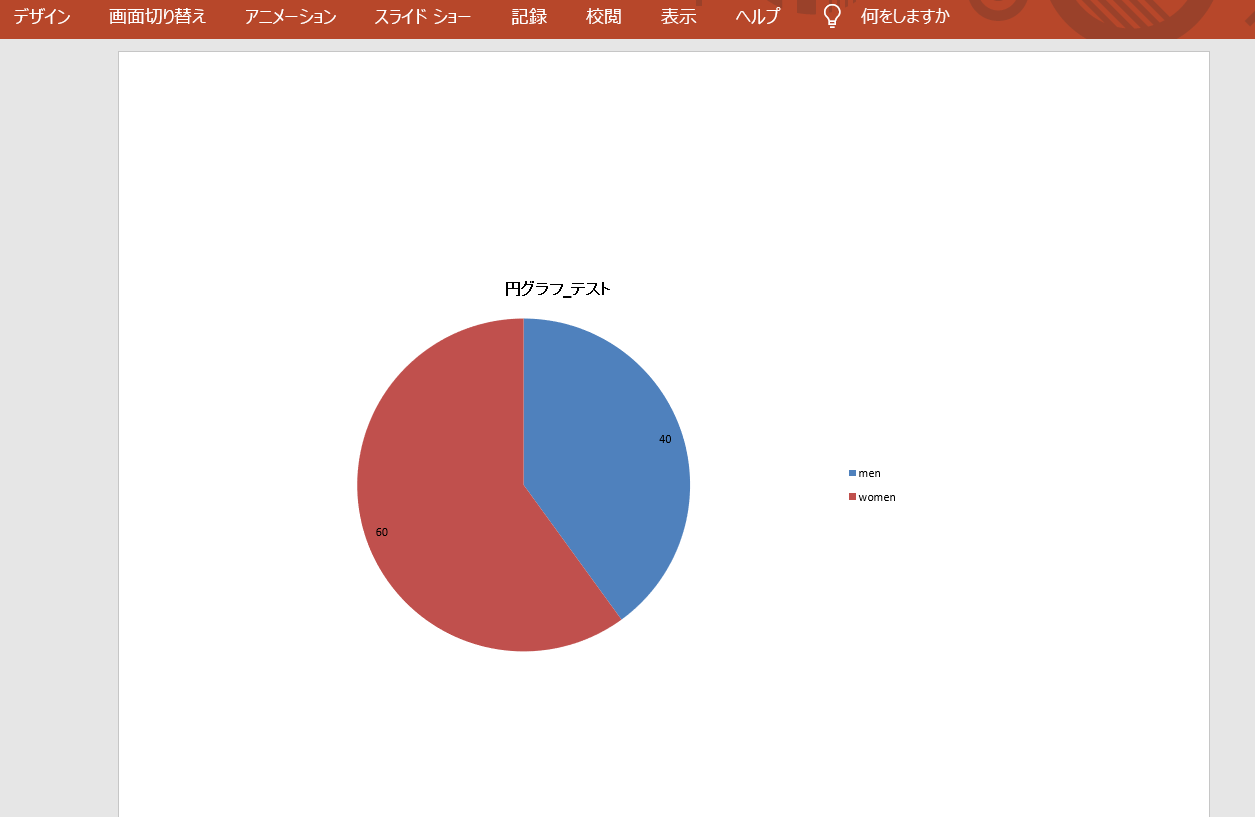
円グラフ
from pptx.util import Cm, Pt
from pptx.enum.chart import XL_CHART_TYPE, XL_LEGEND_POSITION, XL_LABEL_POSITION

layout = prs.slide_layouts[0]
slide = prs.slides.add_slide(layout)
chart_data = ChartData()
chart_data.categories = ['men','women']

chart_data.add_series("Pie", ('40', '60'))

chart = slide.shapes.add_chart(
    XL_CHART_TYPE.PIE,
    Cm(2),
    Cm(5),
    Cm(6),
    Cm(4.5),
    chart_data
).chart

chart.font.size = Pt(8)

chart.has_legend = True
chart.legend.position = XL_LEGEND_POSITION.RIGHT
chart.legend.include_in_layout = False

# グラフタイトルの設定
chart.has_title = True
chart.chart_title.has_text_frame = True
chart.chart_title.text_frame.text = '円グラフ_テスト'
chart.chart_title.text_frame.paragraphs[0].font.size = Pt(11)

# データラベルの設定
chart.plots[-1].has_data_labels = True
data_labels = chart.plots[0].data_labels

data_labels.position = XL_LABEL_POSITION.INSIDE_END
prs.save('sample_with_chart.pptx')
<実行結果>
グラフ線の色や太さの引数について
折れ線グラフなどのグラフの線に関する設定は以下のコードで編集可能です
#Markerを消す
chart.series[0].marker.style = None
#線を追加
chart.series[0].format.fill.solid()
#Markerの枠線のスタイルを変更
chart.series[0].format.line.dash_style = MSO_LINE.DASH_DOT
#線の太さを変更
chart.series[0].format.line.width = Pt(2)
#線の色を変更
chart.series[0].format.line.color.rgb = RGBColor.from_string("000080")
その他のグラフの凡例や軸線に関する設定は以下の記事を参考にしてください
関連記事:python-pptxでグラフの凡例ごとに色を固定する
関連記事:python-pptxでグラフの軸線を削除して非表示にする


コメント
[…] 関連記事:【Python】python-pptxでパワポにエクセルのグラフを追加する […]
[…] 関連記事:【Python】python-pptxでパワポにエクセルのグラフを追加する […]
[…] 関連記事:【Python】python-pptxでパワポにエクセルのグラフを追加する […]
[…] 関連記事:【Python】python-pptxでパワポのスライドに色々なグラフを追加する […]